
Situation: E-commerce Responsive Redesign
Project: Assignment was to create a tablet and mobile version of this e-commerce project page from Sears.com.
Action
Mobile first design does not mean designing for a smartphone in my mind. It means creating the simplest design that is both aesthetically pleasing and efficient. Designing for the mobile interface forces me to do this so my philosophy is to design for that platform and you'll be well on your way to user-centered design. For the e-commerce website I concentrated on two areas: navigation and interaction design.
Navigation
My desire with this design is to put the user in the driver’s seat. I didn’t cut out a lot of content; rather I allowed it to be collapsed and hidden and revealed by the user in her own time as needed. I call this design “Tap and Go.”

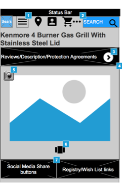


Interaction Design: Mid-Fold Navigational Menu
Mid-fold List Menu
I split the content into two: above the fold and below the fold. The above the fold content I left behind a drop-down menu accessed right above the product image. This content included links to the "Reviews/Product Descriptions/Protection Agreements" section as these areas are highlight on the original website. Then I inserted a "mid-fold list menu." This allows the user to access the information below the fold but uses keyword phrasing so they can go directly to what they're looking for without scrolling.
I also added a “Back to the top,” arrow. I feel sometimes users can get lost scrolling through endless amounts of content and offering them a way back to the purchasing section aids in their decision-process. This is called a “task relevant cue.” It aids the user in decision making.
Mood Relevant Cues
I added a "mood relevant cue," by linking the top “Reviews,” section to the Most Helpful Reviews subhead instead of just reviews that were below.