
Kellstadt "Admission" Redesign
SITUATION
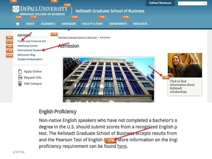
Enrollment to the Kellstadt Graduate School of Business was in decline. The school depended heavily on it's website to recruit students. Using the website's quarterly analytics report I noticed that 90% of the website's traffic ended up on our "Admission," landing page. However, more than 70% of that traffic to that page "dropped off," exiting our website.
I wanted to see why users were exiting our website from that section so quickly as well as how we could redesign the content to get them to stay. I chose to conduct a usability test to see how students navigated the page's content and determine if there was a way to improve the usability of the "Admission," section.
ACTION
My process included the following:
- Met with internal stakeholders from marketing, recruitment and academic advising to gain their insights.
- Used their help to recruit students for a usability test.
- Conducted a usability test to see what barriers and pain points students were having using the section.
- Participants not only performed tasks assigned but also did a post-task survey.
- Did qualitative analysis on the student survey responses and quantitative analysis on their usability test results.
- Use this data to create personas for the website.
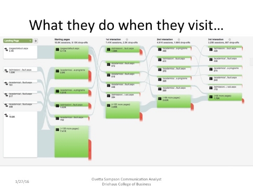
- Paired usability test results with behavior flow and link flow analytics to pinpoint content barriers.
- Developed new navigational structure and content that would allow users to easily get the content they needed.
Usability Test
I recruited six prospective and current students who were enrolled or considering enrolling in Kellstadt Graduate School of Business. The students were asked to complete a series of tasks that are popular with the target audience. The tasks were:
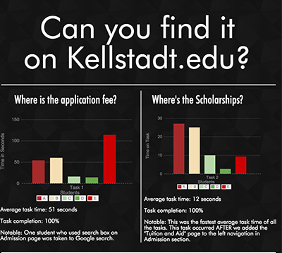
Results of the usability test with students, noting errors made, time on task and Likert scale satisfaction scores.
- Find the fee for applying to the graduate school.
- Find if there are any scholarships available and if so name one.
- Find where to apply for graduate school
- Find how long it takes to complete an MBA
- Find how much it costs to complete an MBA
- Find the admissions deadline
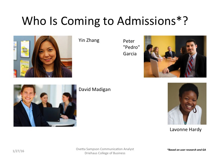
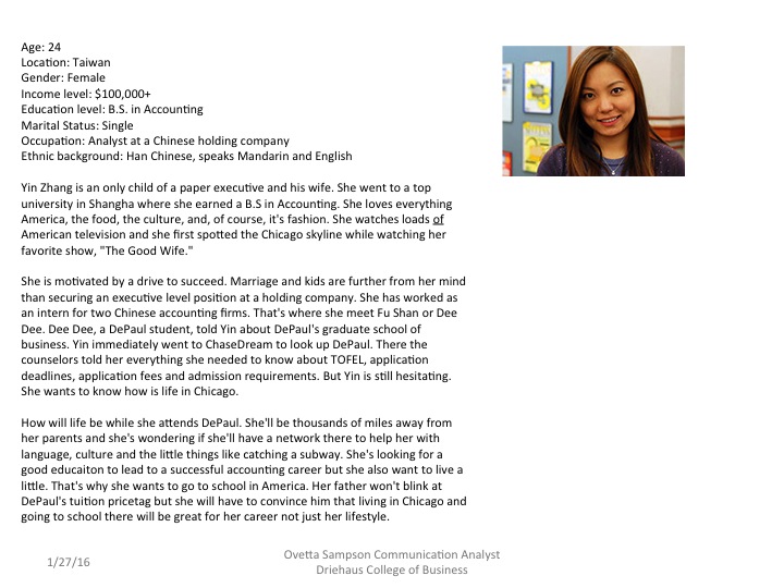
User Personas
After analyzing the data, including interviews with stakeholders and student usability test participants I created personas to help guide the redesign.

Insights
In post-test interviews we learned that students found the section "long," "cumbersome," and content "too much to scroll through." We also noticed students were apt to do "Ctrl 'F'," or type in keywords in a search box to find information rather than use breadcrumbs or left navigation links. They often got lost and links would take them externally. So I made the following recommendations:
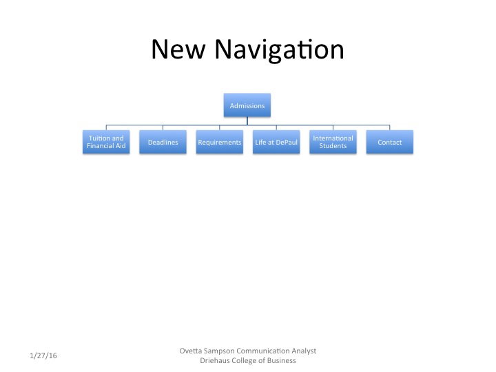
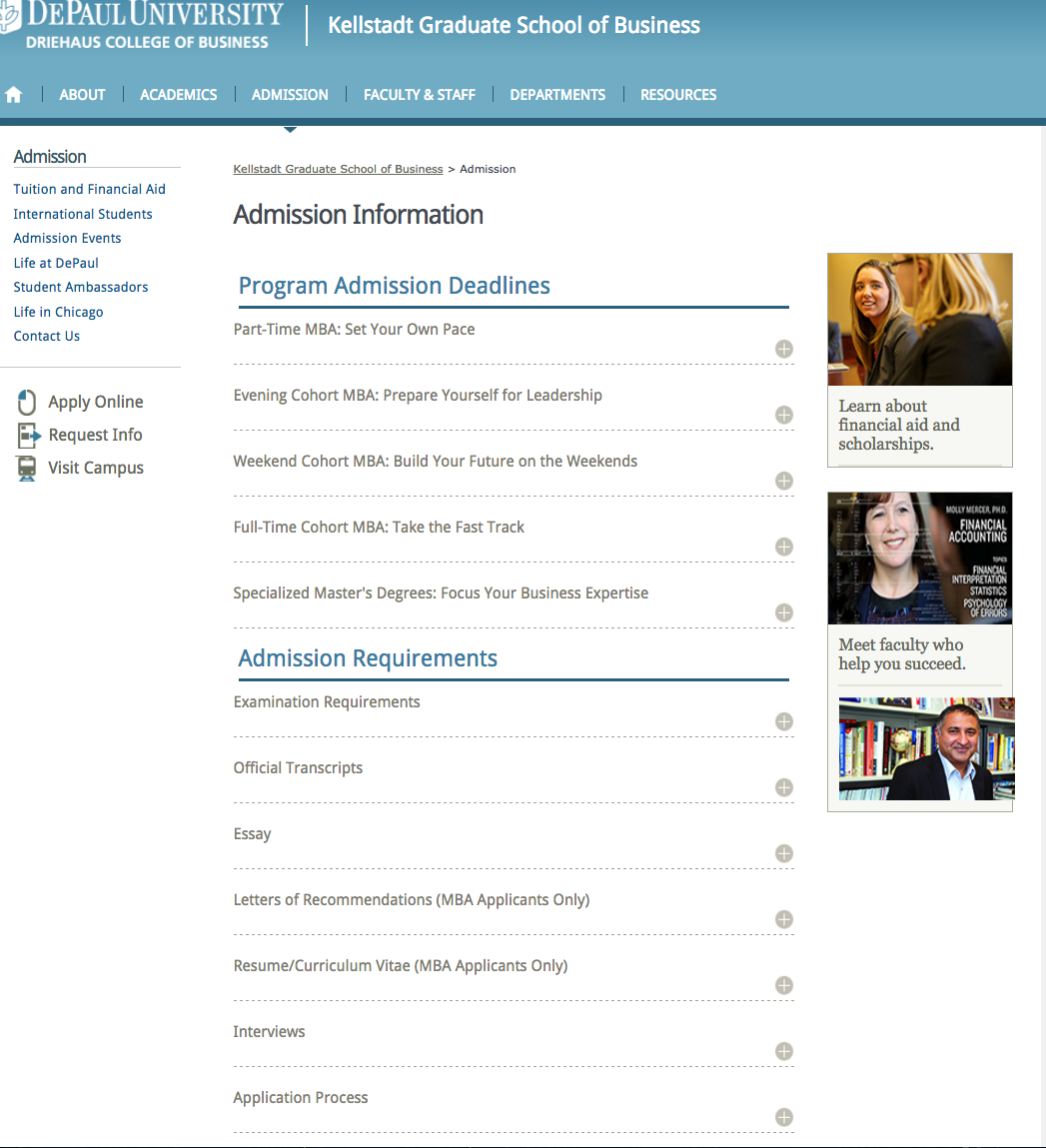
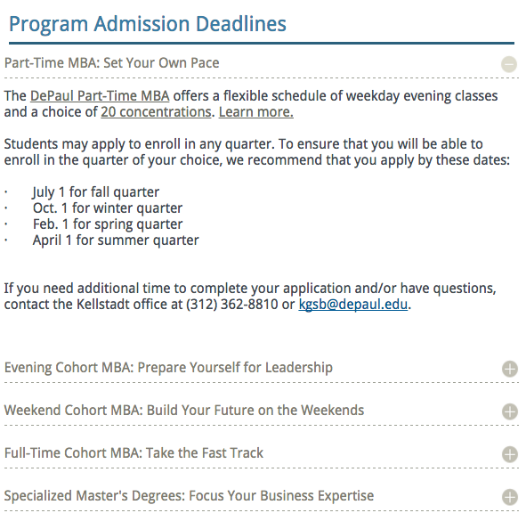
- A slimmer, newly arranged IA structure changing the landing pages and link labels
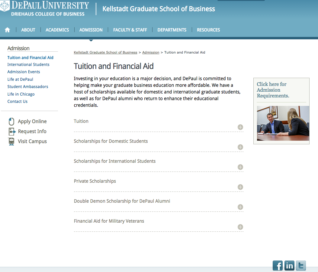
- Addition of user interaction widgets labeled by keywords such as "Deadlines," "Tuition and Financial Aid," "Official Transcripts," and dynamic in nature.
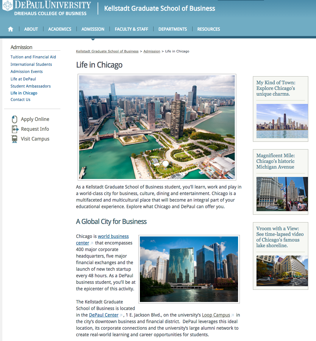
- Addition of multimedia content including videos showcasing what it was like to attend DePaul, live in Chicago and be taught by DePaul faculty.
- Improve wayfinding, ie., limit internal search index to internal pages, change external links to internal links, increase use of key search terms in on-page links, subheads and content.
RESULTS
We reduced the number of users leaving our website, allowed them to find what they wanted in less time and reduced the number of users who left quickly without engaging our content.
- A 26% reduction in bounce rate compared to last year
- A 45% reduction in exit rate compared to last year
- A 50% reduction in time on page (We think this is a good thing as users are finding what they need quickly and not leaving the website but going to our academic program pages) For mobile users we cut this time in half!