SITUATION
Major Taylor Cycling Club of Chicago was a fledging nonprofit with less than 15 paying members. It's new chairman Shawn Conley wanted to grow the club's membership and build community among members with a newly designed website.
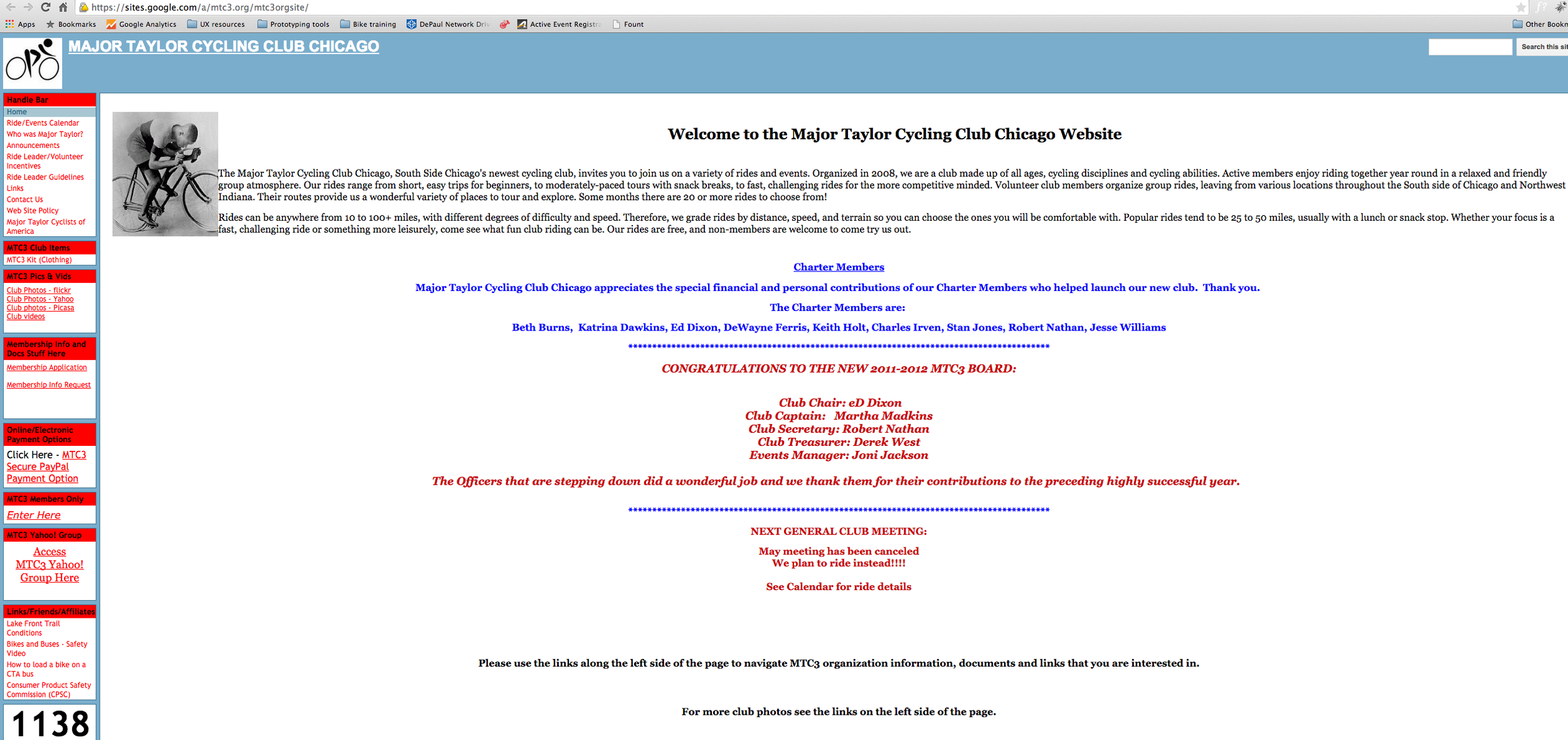
The current website was done on a free hosting service from Google and was basically a text version online. But it was difficult for visitors to find the information MTC3 officials wanted them to find.
STEP ONE: CREATE USABILITY MODEL
I had the MTC3 leadership fill out a usability questionnaire. I pushed them to envision a website that was based on users' needs not theirs. I asked them to quickly survey their users (which they did) as well as cyclists in their demographic group to see what users wanted in a website. After culling through survey answers and observing some of the MTC3 member meetings and talking to the organization's leadership we settled upon three main goals for the website:
- Raise awareness of the club and its purpose.
- Create community to grow membership.
- Provide easier ways for cyclists to sign up for MTC3 weekly rides.
We felt that concentrating on these three simple goals would help meet the organization's overall business objective of promoting health through cycling in Chicago.
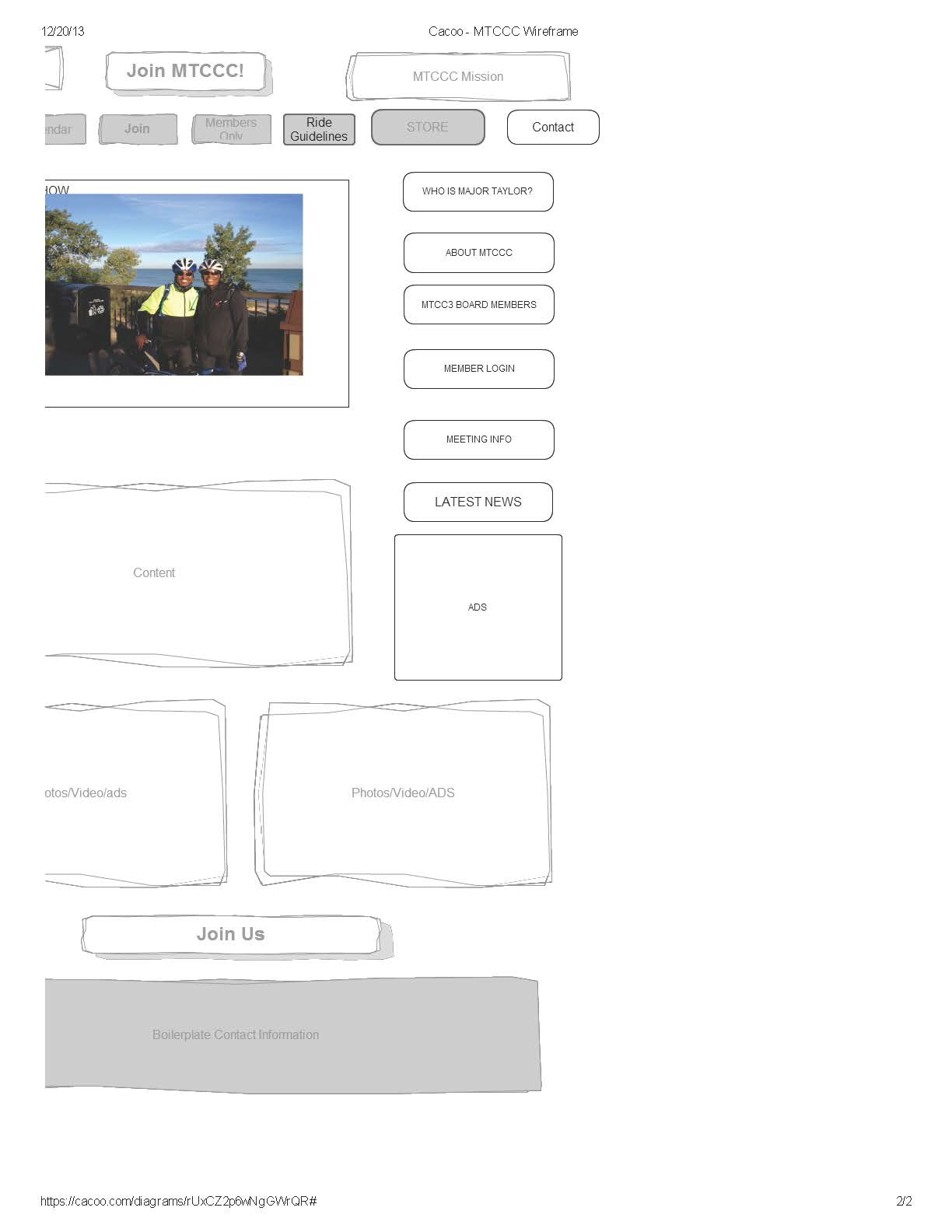
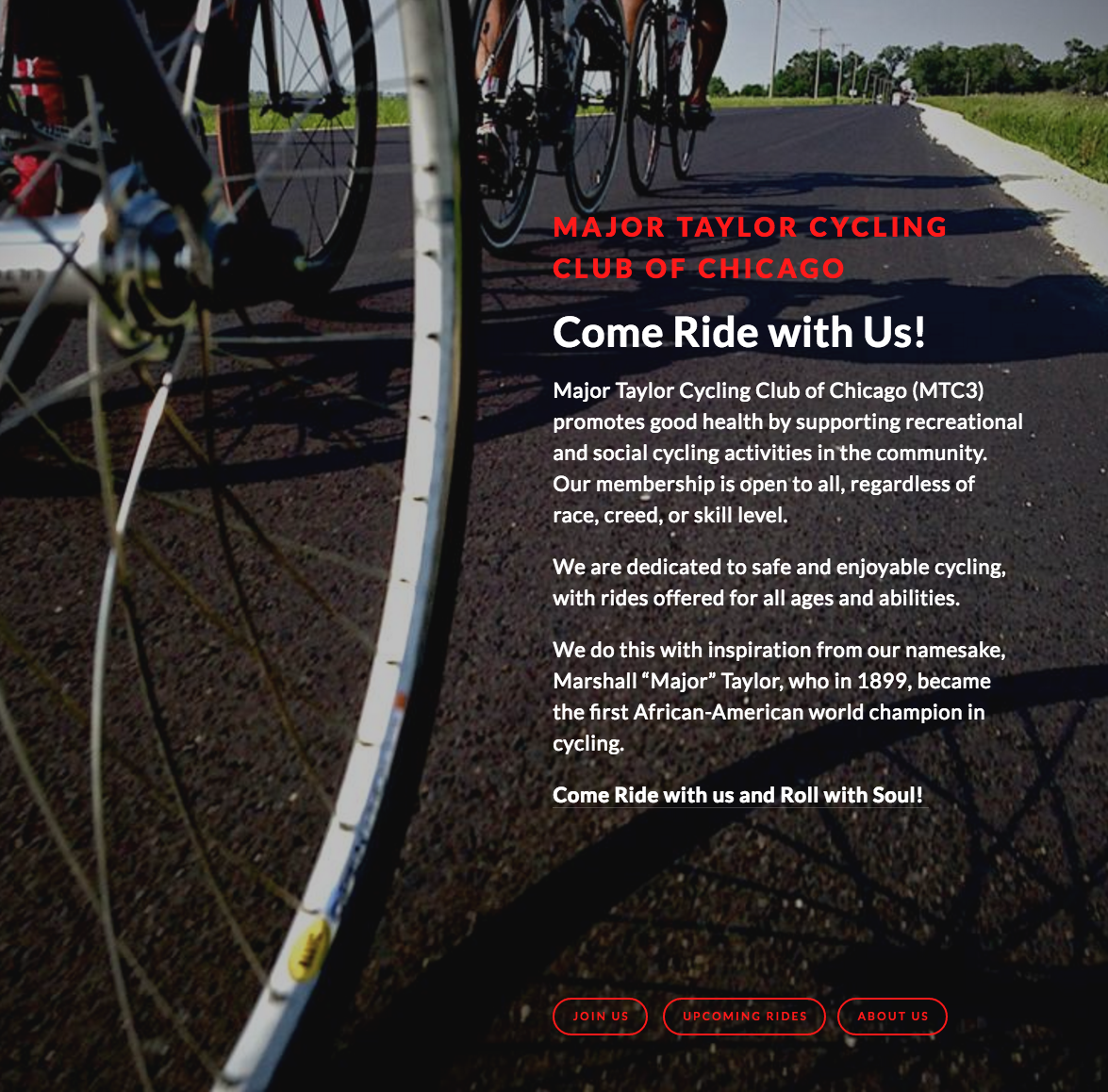
STEP TWO: CREATE WIREFRAME PROTOTYPE
My first notion was that this was an cycling club and its mission is to get people active and outdoors so they can be healthier. I wanted a more dynamic feel. Less text more action.
So I redesigned the website to feature imagery to communicate with users. I added buttons instead of links to make the content more active and action-oriented.

STEP THREE: ADD ADDITIONAL FIREPOWER TO SUPPORT NEW DESIGN

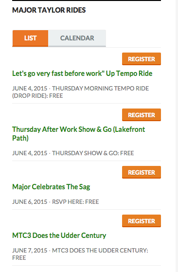
Eventbrite Plugin to List weekly rides.
- I added the Eventbrite plug in feature to list their weekly rides on the left nav. As well as on the right column.
- created a Paypal plugin for them so they could process membership payments automatically form the website as well as thank new members automatically.
- I added a Facebook plugin to connect an already robust social network community to their website.
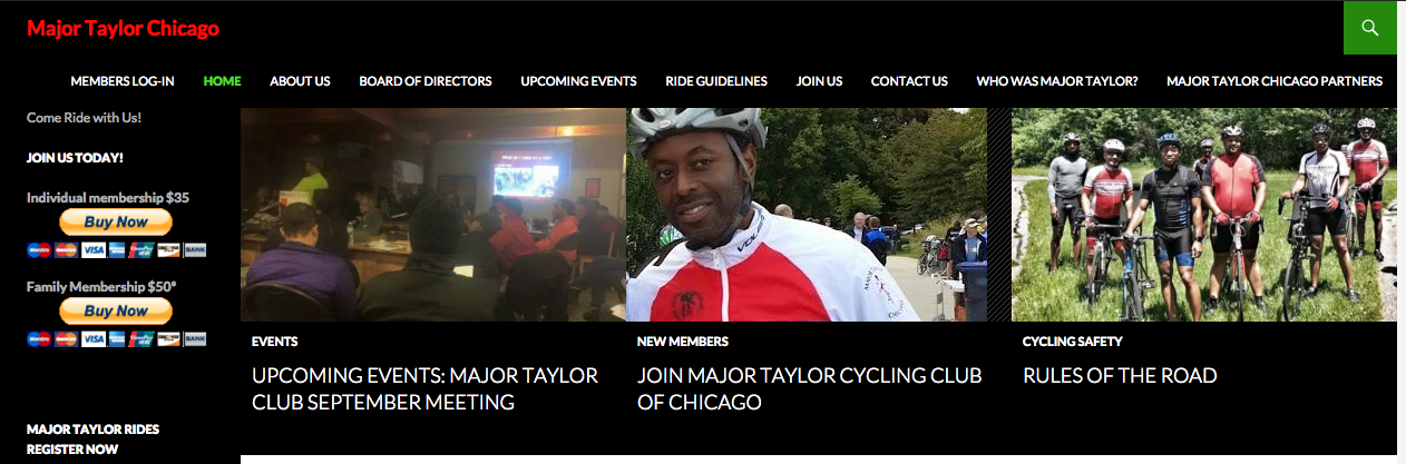
Wanting to create a more aesthetically pleasing user experience I convinced the organization to switch from the cluttered Wordpress platform design to a more elegant one on Squarespace. We were able to make the event section more prominent and the entire website more appealing to users.

RESULTS
Membership increased 350%. The website drove the group's increased social media and e-mail marketing efforts. All the communication they sent out to members pushed them back to the website to either RSVP for events or join their membership. Club officials printed the website on cards and emblazoned it on apparel.

Major Taylor Chairman Shawn Conley
From MTC3's chairman:
"Easier navigation along with a more attractive website definitely helps drive traffic to the page, keeps traffic on the page, and ultimately, got people to join. Not only that, but we have more people using the RSVP function, I suppose because that's easier to find and fill out. Our membership has grown about 350%, and although we've worked very hard, in person, to make that happen with other programs, the website changes definitely helped to contribute to that growth."